CONTEXT
Pinpoint is a knowledge management system for frontline customer service associates of a fortune 500 financial organization. This tool is the merger of two homegrown systems used by different departments within the bank.
In May of 2018 Pinpoint was awarded the ‘Circle of Excellence,’ Capital One’s most prestigious honor.
Role
Principal UX Designer
METHODS & TOOLS
Sketch
Axure
DATE
Launched in 2017
Understand the Problem
With a 3 month turn around to deliver the MVP, we hit the ground running. The development team had an initial concept and we needed to ensure it aligned to design standards across the bank in addition to providing an easily digestible content-rich experience to our call center, branch, and café associates.
Our first objective was to peel back the layers and decipher the Product Owner's intent verse the associate’s need. And simplify.

Early wireframes
A few months before the kick off of this project, a design thinking workshop was conducted. This is the quick wireframe from that session. We used this as inspiration to move into the first round of concepts to better understand the requirements of this application.
Understanding the various roles of our associates and how specific content is pertinent to each role was a major factor in the architecture of this application.
Knowledge from previous side-by-side sessions conducted to understand how associates use existing applications for servicing was utilized.
Concept
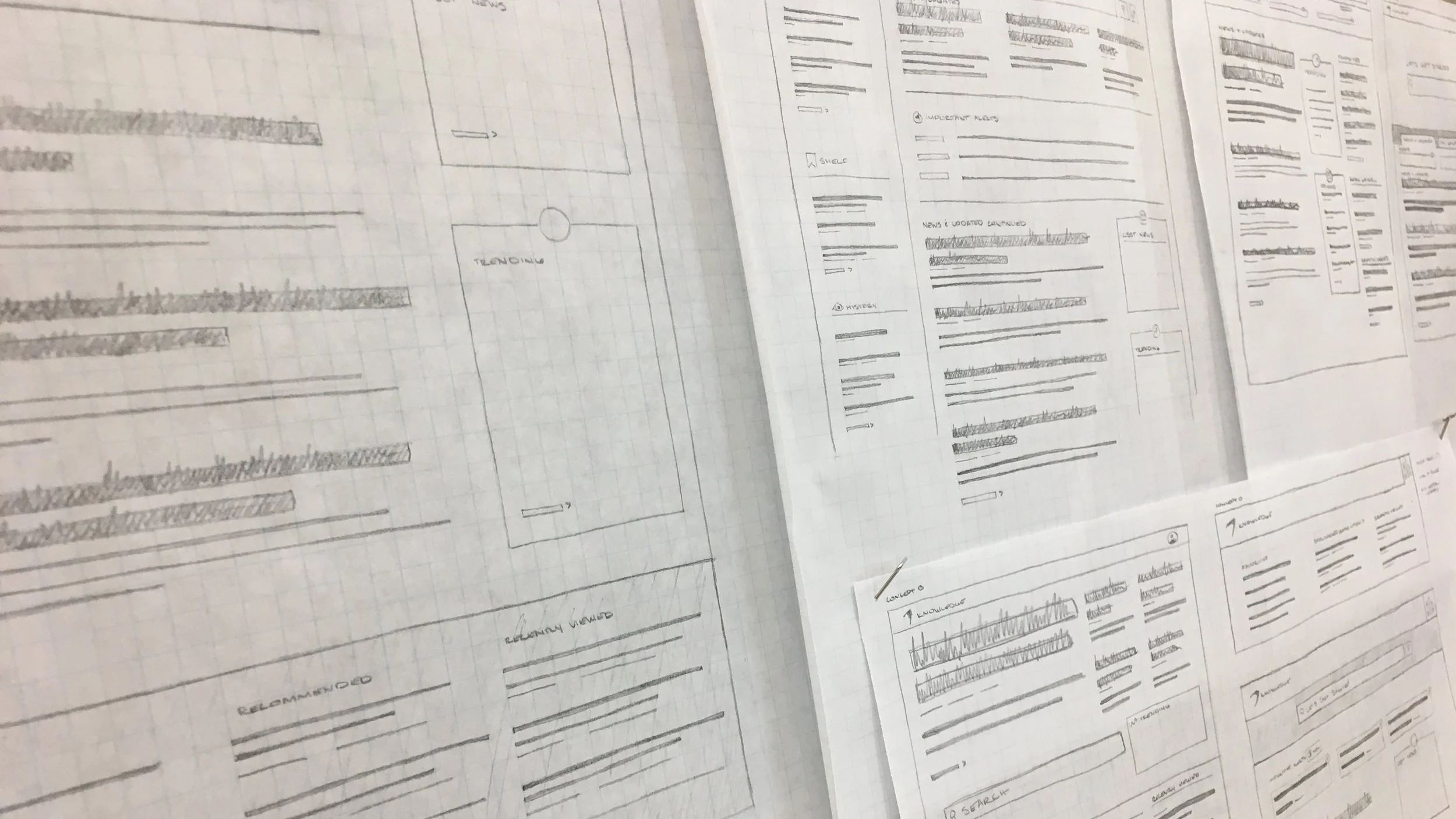
Sketched concepts
After reviewing the content necessary for the initial screen of Pinpoint, various concepts were explored to push initial reactions to a preconceived solution and spark an ongoing conversation about intent and feasibility.

Lo-fidelity mock-ups
Moving into wireframes allowed us to more clearly see the viability of each concept and understand the necessity of each piece of content. Weekly check-ins began with the Product and Dev teams.

Exploration of concepts
As we moved through the design process it was important for us to keep MVP verse future-state in mind. Designing for the future use of multiple devices was also very important. We needed to ensure expectations were going to be met and a sprint schedule was established for the timely delivery of assets.
Create & iterate
Throughout the design process, critiques were held with the creative director, broader design team, product owners and dev teams.

Progression of the landing page from lo-fi through final UI

For comparison, Frank is the content management solution (CMS) that Pinpoint replaced
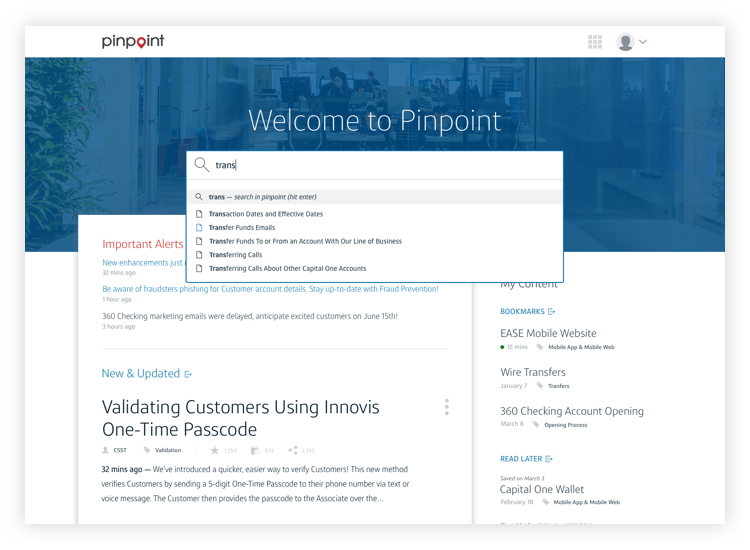
By removing the left navigation, we removed the ‘hunt-and-peck’ interaction and brought the user's focus to the search functionality. A ‘My Content’ area was also introduced for quick access and retrieval of historical information. The most well received feature within the 'My Content' area is the ability to share an article. This comes in very handy when trying to assist another associate with their customer or when a manager wants to reiterate a new feature or process.

Progression of concepts for ‘My Content’

Progression of ‘Search’
To ensure the success of a responsive layout, we opted to keep the experience consistent with tablet and mobile devices by utilizing a drawer menu for filtering. Associates are on the phone with customers and every second counts, we created the ability for associate to customize their search preferences for a streamlined approach.

An article in Frank compared to the final layout of an article in Pinpoint
The most impactful recommendation UX made was for the content writers to engage with the Content Strategy team. We gave a strong recommendation for consolidating the over usage of bullet points to allow the content to speak for itself through the strong usage of typography and various interactive devices — a stepped approach for accomplishing a deposit for example.
Prototype

To assist both the Product and Dev teams understand expected functionality, a prototype in Axure was created.
IMPLEMENT
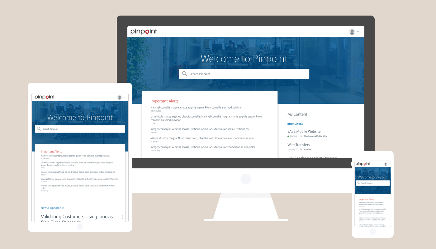
Here are a few of the screens from the final handoff.


RINSE and REPEAT
Ongoing usability testing is currently being conducted as this platform roles from pilot into production for all teams within the bank.
Pinpoint was fully launched and adopted as of November 2017.
